
Creating a seamless, user-friendly interface is not just the responsibility of designers. As a developer, I’ve realized that understanding the basics of UI/UX design is crucial. Not only does it make you a more effective collaborator with designers and clients, but it also helps your projects stand out. And no, you don’t need to become a full-time designer! 🙅♂️
Let's break down why every developer should know the basics and how it can level up your work! 🚀
Why Developers Should Learn Basic UI/UX Design
1. Collaborate Like a Pro with Designers 🧑🎨
Remember the last time you worked with a designer? You probably thought, “Why do they care so much about spacing and button colors?” 🙄 Well, here’s why: those little details matter.
Learning basic design principles will help you decode this "design language" that designers speak. It’s not about nitpicking; it’s about making the interface feel balanced and consistent. When a designer asks for a 16px margin, it’s not random—it’s a carefully thought-out decision to create that balance.
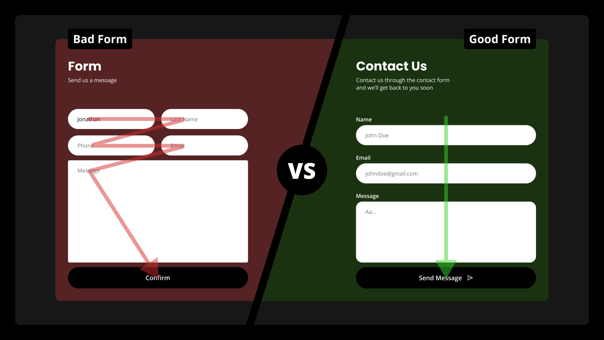
Here’s an example: I once worked with a frontend developer who followed the general design I gave him, but he decided to "wing it" on the spacing, font sizes, margins, and paddings—thinking it wasn’t that important. 🤦♂️ He just guessed the values to save time.
When the website went live, it looked nothing like the design I envisioned. The text was cramped, buttons were too far apart, and the overall layout felt disjointed. It was a huge mess. 😬
So why did that happen? Well, design isn’t just about the overall look—it’s about every pixel. A small change in spacing or font size can throw off the entire experience. Consistency is key. Those small details? They add up to create a cohesive, polished look. It’s not just about aesthetics; it’s about user experience. And when you skip those, users notice, even if they can't always explain why something feels “off.”
That’s why following the exact measurements and design specifications from the designer is essential. It’s not about guessing—it’s about keeping the integrity of the design intact. 🙌
2. Add More Value to Your Freelance Work 💼💡
Clients love a one-stop shop. If you can tweak designs, suggest improvements, or build a clean UI without endless back-and-forth, they’ll notice. 💥
3. Create Interfaces Users Actually Like ✨
A well-coded feature can be perfect, but if the UI/UX isn’t there, users won’t care. 🚫 For instance, a login form with unclear error messages? Users will bounce faster than you can say "bye clients". Knowing the basics allows you to anticipate pain points and prevent frustration.
Core Principles of UI/UX Design
Understanding User Needs
Imagine building a contact form: Could you just slap on some fields and call it a day? Technically, yes. But good UX involves thinking about the user journey. Are all fields necessary? Does the "Submit" button provide clear feedback?
🙋♂️Pro Tip: Ask friends to test your design - real feedback goes a long way.
Keeping It Simple
When I first started, I overloaded landing pages with animations, text, and images. Flashy? Sure. Helpful? Nope. 🧐 Now, I stick to minimalism. Whitespace is your friend! It makes everything easier to read and understand. Think of Google’s homepage - simple and effective.
Don’t overcomplicate things. Focus on leading users to your main action - like that bright, glowing “Buy Now” button! 🛒

Visual Hierarchy in Action
Ever noticed how e-commerce websites make the “Buy Now” button stand out? It’s all about guiding user attention with size, color, and position. Just make the primary call-to-action button twice the size of secondary buttons and use a bright, contrasting color. That simple tweak will improve click-through rates significantly. 📈
Consistency Builds Trust
A consistent design is a trusted design. If your website uses three different button styles, it will feel chaotic to users. Keep things uniform!
Start by defining a cohesive color palette. For example:
- Primary color: Vibrant blue 🌊 (for calls-to-action and most important content)
- Background: White 🌫️
- Accent color: Warm yellow 🌟 (for highlights)
And don’t forget typography! Consistent text sizes and weights improve readability and visual flow. Here's a simple typographic scale:
| Text Type | Size | Weight |
|---|---|---|
| Body | 16px | Regular |
| Muted | 14px | Light |
| H3 | 24px | Semi-bold |
| H2 | 48px | Bold |
| H1 | 64px | Bold |
Spacing is equally critical. Utilize a spacing scale like 4, 8, 16, 32, 64 pixels to keep layouts tidy and visually appealing. For example, ensure padding around buttons and margins between sections align with this scale.
Bonus: Tools like Material UI, shadcn-ui, and Tailwind CSS provide ready-to-use components that help you maintain a cohesive look without reinventing the wheel every time. They come with pre-defined styles for buttons, typography, spacing, and more, so you can focus on functionality rather than formatting.
Mastering Color and Typography
Pick a simple color palette - three to four colors are plenty. When designing a portfolio, I often choose a neutral background, a bold primary color, and a softer accent color to create contrast. For example, a soft gray background paired with a vibrant blue for call-to-actions and a subtle coral accent can be both professional and visually appealing. Tools like Coolors or Realtime Colors make it easy to generate harmonious palettes and explore variations.
Typography, on the other hand, is all about readability and personality. A great starting point is Google Fonts, which offers a wide array of typefaces. Pairing a sans-serif like Roboto or Inter for body text with a classic Poppins or Montserrat for headings creates a balanced look.
Finally, test your colors and typography in different contexts. A vibrant color that looks great on a desktop may be too harsh on mobile, or a thin font weight may lose legibility on low-resolution screens. Tools like Stark allow you to check color contrast and accessibility, ensuring your design is inclusive and effective.
Practical Tips for Developers to Improve Their Design Skills
1. Start with Wireframes 📝
Before coding, sketch out your ideas. Think of wireframes like blueprints - they're much easier to adjust than a live site. I usually start on paper and then use Figma to add more details.
2. Use Frameworks Wisely ⚙️
Frameworks like shadcn-ui or Tailwind CSS are great for more than just speeding up development. They provide clear rules for spacing, typography, and responsiveness. I use them in every project - it's a real game-changer. 🚀
3. Gather Feedback (and Actually Use It) 🗣️
Test, test, test! Just ask and listen. Even a small tweak can make a massive difference. Always ask for real user feedback and iterate, iterate and just... iterate.
Tools and Resources That Help
Tools to Start Designing
- Figma: For wireframing and prototyping.
- Realtime Colors: To generate harmonious color schemes.
- Google Fonts: For selecting and pairing typefaces.
Where To Learn
- My favorite X (Twitter) account: Just check her out
- Pinterest: My first choice when it comes to inspiration
- YouTube: Channels like "Flux Academy" or "Juxtopposed"
Bringing It All Together in Your Projects
Efficiency Meets Quality ⚡
With a design system in place, you can move faster without sacrificing quality. Predefined components mean you don't have to code buttons from scratch or figure out the right spacing on your own. Plus, these systems ensure everything from typography to button styles matches across your entire project, giving your app a professional feel with minimal effort.
Ready for the Real World 🌍
A polished design system also means you can easily scale your project. Need to add a new feature or update an existing page? You won’t have to start from zero. With everything in place, you can modify and extend your interface without worrying about breaking your design. Whether it’s adjusting colors, fonts, or layout components, your UI remains cohesive.
By combining design systems with your development skills, you’re not just creating visually appealing websites - you’re creating user-friendly, functional, and efficient designs that work seamlessly across all platforms.
Final Thoughts
Learning basic UI/UX design isn’t about becoming the next Steve Jobs—it’s about making your development skills more well-rounded. By focusing on the user, staying consistent, and using the right tools, you’ll create interfaces that look great and work even better. Whether you’re freelancing or part of a team, these design basics will take your projects to the next level.
So, start small, experiment, and most importantly - have fun building! 💪